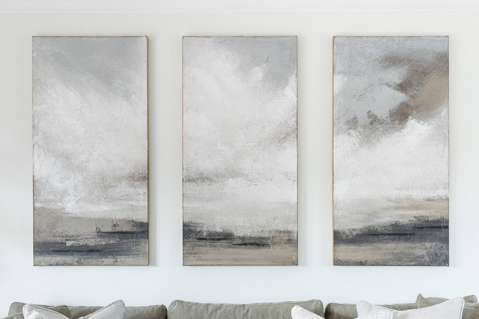
A cheap-looking interior usually results from mismatched finishes, poor spatial planning, and choices that prioritise immediate visual impact over durability and coherence. The studio’s Discovery and Concept phases focus on identifying what truly serves a space—materials that age well, layouts that function without visual strain, and restraint in detailing. The difference between an affordable interior and a cheap-looking one lies not in budget, but in intentionality.
Why visual coherence matters more than individual items
Cheap-looking spaces rarely fail because of a single poor choice; they fail because choices contradict one another. A room filled with mismatched material scales—glossy laminate next to raw wood, cold tile beside soft carpet without transition—signals that decisions were made in isolation rather than as part of a whole. The studio’s Concept, Design & Specification phase establishes a material and finish strategy that treats every surface, fixture and plane as part of the same conversation. This coherence is what allows modest materials to feel considered, and what prevents expensive items from appearing out of place.
During the Discovery phase, the studio maps how light moves through a space, how people move through it, and what materials will be seen together. When finishes are chosen with this understanding, even an economical palette reads as intentional. A commercial project like Tone at Canary Wharf demonstrates this: the material choices work because they were specified as part of a unified system, not selected individually. The same principle applies to residential work. Consistency in finish logic—matte versus gloss, warm versus cool undertones, texture rhythm—creates visual weight that cheap-looking interiors simply lack.
How poor spatial planning reads as low-quality
Cluttered, poorly proportioned or illogically arranged interiors immediately register as cheap, regardless of item cost. A sofa positioned too close to a wall, floating furniture with no clear relationship to the room’s geometry, or storage that visually competes with living space all create visual chaos. The studio’s Discovery phase includes spatial analysis: understanding sight lines, traffic flow, and the proportional relationship between furniture, walls and ceiling height. When these fundamentals are respected, a simply furnished room feels calm and intentional.
The residential projects undertaken by the studio—including the London Embankment Apartment and the Witham Project—treat space as a design element itself, not as a container to fill. Poor planning often manifests as compensatory decoration: too many objects, layered patterns, or colour applied as visual distraction rather than as structure. A well-planned space needs fewer objects to feel complete, and those objects have clear purpose and position. This spatial clarity is almost impossible to fake; it either exists from the outset or it requires rethinking the layout entirely.
Which finishes and materials signal lack of care
Certain material choices reveal themselves as poor-quality not through appearance alone, but through how they age and perform. High-gloss finishes on large flat surfaces (walls, cabinetry) show every mark and footprint, requiring constant cleaning and eventually looking scuffed or tired. Thin veneers that chip easily, plastic edging that peels, or joins that gap after settling all communicate that cost-cutting, not design, drove the decision. Materials chosen for the Fruittii Hair Salon, Beaulieu Dental Practice and Keystones Estate Agent were evaluated not only for how they appear on day one, but how they perform under use and time. A material that wears visibly but maintains structural integrity (solid wood, quality plaster, natural stone) reads as honest; one that degrades unpredictably reads as cheap.
During Concept, Design & Specification, the studio specifies finishes that are robust enough to handle real life without requiring defensive maintenance. Matte and satin finishes age more gracefully than gloss. Natural patina—the slow marks of use on leather, wood or stone—reads as quality because it signals durability and longevity. Conversely, materials chosen purely for initial aesthetic impact (high-gloss MDF, thin laminates, bright synthetic fabrics prone to pilling) visually deteriorate and expose their cost-focused origins. The most considered interiors often employ humble materials—plaster, linen, solid timber—because their durability and honest ageing are part of their appeal.
The role of detailing in perception of quality
Fine details accumulate to create a sense of quality or its absence. Unfinished edges, misaligned joints, fixtures that don’t quite fit their openings, and hardware chosen without regard for material compatibility all signal that the interior was assembled rather than designed. The studio’s Commission and Reveal phases include rigorous attention to execution: how a shelf aligns with a wall plane, how a door frame meets an architrave, whether hardware scales to its context. These details are invisible when done well; when absent, they undermine the entire composition.
Restraint in detailing is often the mark of quality. Over-ornamented surfaces, applied mouldings that serve no structural purpose, or unnecessary trim layers create visual noise. A well-detailed interior allows quiet materials and simple geometries to carry weight. This is not minimalism for its own sake; it is the principle that every element should earn its presence in the space. When the studio moves through the Reveal phase of a project, the goal is always an interior that feels inevitable—as though the space could not logically be assembled any other way. Cheap-looking interiors, by contrast, feel optional: this piece could have gone elsewhere, that finish could have been different. Intentionality in detailing closes that gap.
Why colour applied without structure creates visual discord
Colour applied as decoration rather than as structure almost always reads as cheap. A wall painted a trendy shade with no relationship to the room’s light, materials or proportions creates visual strain. The same principle applies to saturated accent colours used without restraint: they compete with one another and make a space feel unstable. During the Concept, Design & Specification phase, colour is treated as a tool for spatial definition, not visual interest. It clarifies zones, responds to natural light, and creates harmony rather than contrast for its own sake.
A considered colour palette often appears more limited than it truly is, because colours are chosen to work together across multiple surfaces and in changing light. The studio’s residential and commercial projects use colour strategically: warm neutrals to create intimacy in small spaces, cooler tones in areas that benefit from spatial expansion, accent colours applied to structural elements (door frames, shelving) rather than arbitrary walls. This approach requires more thought than painting a feature wall, but the result reads as intentional and composed rather than decorative and scattered.
How to recognise quality thinking in your own space
If you’re assessing an interior—your own or a potential new space—ask whether decisions appear connected or isolated. Do the materials and finishes speak to one another, or do they feel assembled from separate sources? Is the spatial arrangement logical, or does furniture seem placed to fill empty floor? Do surfaces show honest wear, or do they look damaged? Does colour serve the room’s geometry and light, or distract from it? A quality interior answers yes to most of these questions without requiring explanation. The studio’s process is designed to reach that state of inevitability: a space that feels right because every element was considered in relation to every other.
Recognising cheap-looking choices in advance is the first step toward avoiding them. Quality is not a premium product; it is a way of thinking about how materials, space and light work together. When decisions are made during Discovery and Concept with this understanding, even modest budgets yield composed, durable interiors that age well and feel intentional. The opposite—choosing items individually and hoping they cohere—is often the real cost: money spent on items that feel incoherent, age poorly, or require constant replacement.