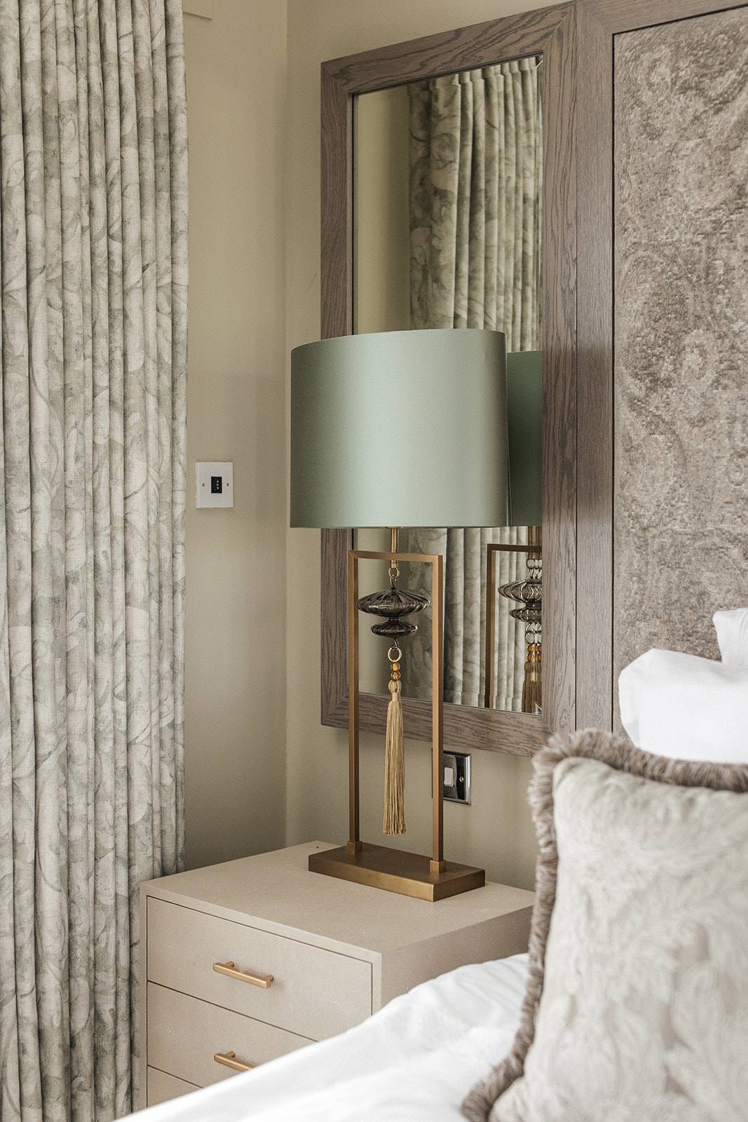
Colour choice in interior design is not aesthetic preference alone—it directly influences how occupants feel, behave, and perceive the function of a room. The studio’s approach to colour begins in Discovery, where the intended use of the space, its users, and the mood required are established before any palette is proposed. This guide shows how colour psychology moves from theory into practice, grounded in real commercial and residential projects.
Why does colour matter more than most designers discuss?
Colour is often treated as the final decorative layer—a choice made after layout, materials, and function are locked. In practice, colour carries the psychological and functional weight of the interior. A dental practice requires different colour language than a hair salon; a London apartment needs to work against urban light; a commercial reception must communicate brand values at a glance. The studio’s process recognises this by placing colour discussion early, during Discovery, when the client’s brief and the space’s purpose are still being refined.
Colour psychology is not mysticism. Research shows measurable responses to hue, saturation, and value. Cooler tones (blues, greys) tend to calm and focus attention; warmer tones (reds, oranges, ochres) energise and draw the eye. Neutral grounds (whites, greys, warm beiges) anchor other elements and allow flexibility. The studio’s work at Beaulieu Dental Practice, for example, used soft warm neutrals to reduce anxiety in a clinical setting, while Fruittii Hair Salon relied on deeper, warmer accents to create energy without overstimulation. Neither choice was arbitrary; both were rooted in the function and the occupant’s emotional state during use.
How does the studio integrate colour psychology into the design process?
The studio’s work unfolds across five stages: Discovery, Concept, Design & Specification, Commission, and Reveal. Colour strategy begins in Discovery, where the studio establishes the intended mood, the user profile, and the space’s primary function. A commercial reception (such as Keystones Estate Agent or Tone at Canary Wharf) demands colours that signal professionalism and trustworthiness; a residential apartment (London Embankment Apartment, Witham Project) requires palettes that feel personal and liveable over years, not weeks.
During Concept, colour directions are tested against the brief. The studio avoids presenting a single ‘final’ palette too early; instead, two or three directions are explored, each justified by the psychology of the space and the client’s stated needs. This prevents colour from becoming a preference argument and keeps it grounded in function. Concept, Design & Specification then locks the palette and applies it to finishes, paint, textiles, and fixtures. At this stage, the studio’s decisions are documented—not as trends, but as measurable specifications that the contractor and the client understand. This transparency means the Reveal is never a shock; the colour story has been visible and agreed throughout.
What does colour restraint mean in luxury interior design?
Restraint in colour is not minimalism or blandness. It is the deliberate choice to use colour strategically rather than abundantly. Many interiors fail because too many hues compete for attention, leaving the space feeling chaotic or dated. The studio’s palette for commercial and residential projects typically rests on two to three dominant colours, with accent colours introduced sparingly through textiles, artwork, or a single feature finish.
At Beaulieu Dental Practice, the primary palette was warm neutral (off-white and soft taupe), with a restrained accent in a muted sage green used only on a feature wall in the waiting area. This restraint allows the eye to settle; occupants feel calmer because the visual environment is ordered, not overwhelming. At Tone at Canary Wharf, a similar discipline applied—a neutral ground with darker, richer accents in timber and textiles rather than paint. Restraint also protects against trend obsolescence. A space painted in five bright colours dates rapidly; a neutral anchor with restrained accent colours remains timeless. This is not about avoiding colour; it is about respecting its power and deploying it where it matters most.
How do material and light affect colour psychology?
Colour exists only in the context of light and material. A paint swatch looks different under artificial light, natural daylight, and at different times of day. Equally, the same colour on matt plaster reads differently than on timber panelling or a glazed ceramic. The studio’s Concept, Design & Specification stage accounts for this by specifying colour in relation to the material finish and the space’s light quality. Residential projects (London Embankment Apartment, Witham Project) receive particular attention here, as the space must work across morning light, evening light, and artificial task lighting. A colour that feels warm and grounding at dawn may read cold and unfriendly under tungsten at night if the material finish is too reflective.
Commercial spaces like Keystones Estate Agent and Fruittii Hair Salon are similarly calibrated. A hair salon requires lighting that is accurate enough for colour work; the wall colours must complement that lighting without creating an atmosphere that is too clinical. In contrast, a reception like Tone at Canary Wharf uses colour to leverage the space’s existing natural light—cooler tones in north-facing rooms, warmer tones where south-facing light is strong. The studio tests colour samples not on white boards in showrooms, but on the actual walls of the space, at different times of day, before final specification. This is not extra cost; it is diligence that prevents regret after Commission.
What colours work in commercial versus residential interiors?
Commercial spaces have different psychological requirements than homes. A dental practice must reduce anxiety; a salon must energise without overstimulating; a reception must signal confidence and professionalism. Residential spaces must support daily life, rest, work, and social gathering—often all in the same footprint. The studio’s palette decisions reflect this distinction. Beaulieu Dental Practice used warm, soft neutrals that calm without feeling institutional. Fruittii Hair Salon introduced deeper, warmer accent colours to create dynamism in a functional space. Keystones Estate Agent employed cooler, more formal tones to convey stability and professionalism. In contrast, residential projects like London Embankment Apartment and Witham Project prioritised personal livability—colours that felt both restful and warm, allowing residents to inhabit the space comfortably over years.
The studio avoids importing commercial colour strategies into homes, or vice versa. A colour that works brilliantly in a commercial brief (high saturation, high contrast) often exhausts residents. A colour that feels intimate in a home (warm, saturated) may feel unprofessional in a reception. This distinction is clarified during Discovery, when the studio and client establish the space’s primary function and emotional tone. From that point forward, colour recommendations flow directly from that purpose, not from trend or aesthetic whim.
How do you choose a colour palette you won’t regret?
The studio’s approach to colour selection removes guesswork by grounding every choice in the space’s function and the client’s brief. During Discovery, the studio and client articulate what the space is for, who uses it, and what mood is required. This becomes the filter through which all colour options are tested. A colour may be beautiful in isolation, but if it conflicts with the stated brief, it is discarded. This discipline prevents the common pattern of clients choosing colours they love aesthetically but regret living or working in.
Testing is critical. The studio specifies colour samples large enough to observe under the space’s actual light, at different times of day, and beside the materials they will sit with. A colour approved on a small swatch in a showroom under fluorescent light often surprises when applied to a full wall under natural daylight. The studio mitigates this by testing samples on site during Concept, Design & Specification, before Commission. This adds time to the process, but it eliminates the regret that comes from rushing. By Reveal, the colour is not a surprise; it is a conclusion that client and studio have jointly witnessed and approved.