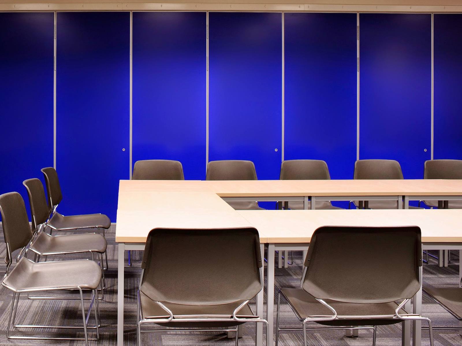
Office planning begins with understanding how people move through and use the space, not with aesthetics or trend. A methodical discovery phase — mapping workflows, identifying bottlenecks, and observing the rhythm of daily work — shapes every decision that follows. When this foundation is solid, the resulting interior supports function for years.
What does the Discovery phase reveal about your office needs?
Discovery is where planning office space begins in earnest. This stage involves direct observation and conversation with the people who will inhabit the space. You walk through existing workflows, note where teams cluster or disperse, identify which adjacencies matter (does the reception need to see the waiting area clearly? do particular departments work in close collaboration?), and spot friction points — bottlenecks at the printer, poor sightlines that fragment communication, areas that feel underused or congested.
For commercial practices — dental surgeries like Beaulieu Dental Practice, hair salons such as Fruittii Hair Salon, or estate agents like Keystones Estate Agent — this observation is particularly precise. A dental practice needs clear sightlines between reception and the consultation area for patient flow and staff coordination; a salon requires intuitive positioning of wash stations relative to styling chairs and storage; an estate agent must balance client meeting spaces with focused working zones for staff. These aren’t assumptions. They emerge from watching the space in use.
The Discovery phase also establishes practical constraints and preferences: natural light availability, acoustic requirements (does this space need quiet focus or can it tolerate higher ambient noise?), storage capacity, IT infrastructure, visitor volumes, and team size trajectories. This data — which is qualitative as much as quantitative — becomes the brief that guides all subsequent decisions.
How does Concept, Design & Specification translate planning into a real layout?
Once Discovery data is gathered, the Concept stage interprets it into spatial strategy. This is where you establish zones: where people work individually, where they meet, where visitors arrive, where materials or equipment are stored. For Tone at Canary Wharf, a commercial interior in a high-density London location, this meant orchestrating multiple functional areas within a constrained footprint — each zone had to serve its purpose without visual clutter or wasted circulation. The concept doesn’t yet specify every desk or chair; it establishes relationships.
Concept, Design & Specification then makes those relationships precise. This is where adjacencies become actual distances, where sightlines are confirmed through scaled drawings and sections, where storage is calculated to capacity rather than guessed, and where materials, finishes, and fixtures are chosen for durability and maintenance reality, not appearance alone. A reupholstered office chair keeps its original frame if it is sound; a desk surface is specified for wear patterns and cleaning ease, not novelty. Specification is the layer where the interior becomes buildable and maintainable.
The layout itself is often deceptively simple — the power lies in the thought behind it. The positioning of a single desk can determine whether someone feels part of the team or isolated. The location of a meeting table relative to the entry can signal whether visitors are welcomed or intrusive. These decisions rest on Discovery findings, not on template plans or trends.
Why does furniture placement matter more than furniture choice?
Many people planning office space begin by selecting desks, chairs, and storage as separate items, then trying to fit them into the room. This reverses the actual priority. The room’s geometry, natural light, acoustic environment, and workflow patterns should dictate where pieces sit. Only then does the choice of what sits there become coherent.
In residential projects like the London Embankment Apartment or the Witham Project, this principle is equally clear: a living space works because furniture is positioned to enhance how people naturally move and gather, not to fill empty floor. In office settings, the same logic applies. Desks positioned perpendicular to windows maximize light without screen glare; clustering workstations around a central meeting point can reinforce team cohesion; positioning quiet focus work away from high-traffic routes protects concentration. These aren’t aesthetic choices; they are functional ones that have immediate, daily impact.
Once layout is resolved, the specification of pieces — their finish, upholstery, scale, and storage capacity — serves that layout. A desk that is too deep may look impressive but will obstruct sightlines or circulation. A chair with wheels works in some zones and creates acoustic and safety issues in others. Good office planning keeps layout and specification in conversation, never treating them as separate disciplines.
How do you plan for change without replanning every few years?
Office teams grow, shrink, merge, and shift focus. An office space planned only for today’s exact needs will feel wrong within 18 months. Discovery conversations should include not just current workflows but anticipated trajectories: will the team expand? will remote work become permanent? might departments combine or separate?
Planning for flexibility doesn’t mean designing a generic, formless space. It means building in graduated capacity. This might mean specifying modular storage that can scale; positioning IT infrastructure so workstations can be added or removed without rewiring; creating meeting spaces that can be reconfigured for different group sizes; or establishing a clear hierarchy of permanent zones and temporary zones. A structural wall should never be sacrificed for today’s layout if it might constrain tomorrow’s.
The Commission and Reveal phases confirm that the designed layout is actually buildable and performs as intended. Problems surface during installation — a door that swings into a workspace, a power point that is three inches too low, an acoustic issue that wasn’t predicted. A well-planned office absorbs these discoveries and remains functional. A poorly planned one falls apart.
What practical steps should you take before engaging a designer?
Before formal engagement, you can clarify your own thinking. Document the team: how many people work where, and what are they doing? Map current pain points: where does the space feel broken? Photograph sightlines, note light conditions at different times of day, measure the ceiling height and identify any structural elements (columns, ducts, windows). Count existing storage and estimate what you actually keep versus what you move through. Observe: where do people naturally congregate? where do they retreat for focus? where do visitors go first?
This isn’t formal research; it’s self-knowledge. It makes the subsequent Discovery phase far more productive because you arrive with clarity about what matters to you, not just what a designer might assume. You also establish whether your current space can be adapted or whether a new location is necessary — a question that no amount of clever design can resolve if the room is simply too small or too poorly lit for its purpose.
Finally, consider the realistic timeline. Office planning moves through Discovery, Concept, Design & Specification, Commission, and Reveal sequentially. Each stage informs the next. Rushing any of these stages creates faults that persist through the finished interior. A methodical process of 12–16 weeks from brief to handover is typical for a considered, functional outcome.
How does good office planning avoid becoming dated?
An office space planned around function, material durability, and clear geometry resists obsolescence far more successfully than one designed around aesthetic trends. Natural materials — solid wood, stone, quality textiles — age visibly but gracefully. Neutral palettes and restrained finishes create a backdrop for the life that happens in the space, not a competing focus. Neutral doesn’t mean bland; it means intentional, considered, and calibrated to the specific light and architecture of the room.
The best office interiors are barely noticeable in the moment — you notice only that the space works, that light falls beautifully, that you can concentrate, that meetings happen easily. You don’t notice the design. That is the marker of planning done well. Trends are visible by definition. A timeless interior is invisible because it serves its purpose so thoroughly that the design dissolves into function. This is restraint as a design principle, and it is what distinguishes an office that feels relevant in year three from one that feels tired.